


The Silent Revenue Killer: Why Your Facebook Retargeting Strategy Is Leaking Money
April 14, 2026
Why More Facebook Ads Budget Won’t Fix Poor Performance
April 17, 2026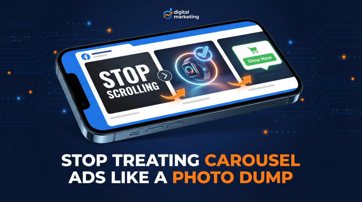
Over the last eight years, I have audited hundreds of Facebook Ad accounts. And when I dig into the creative reporting, I see the exact same tragic story play out almost every single time.
A brand spends thousands of dollars on a photoshoot. They get beautiful, high-resolution images of their products. They upload five or six of these images into a Facebook Carousel Ad, hit publish, and wait for the sales to roll in.
And then… nothing happens. The cost per click is astronomical. The return on ad spend (ROAS) is abysmal. The campaign bleeds money until the founder or marketing manager finally pauses it in frustration, concluding that “carousel ads just don’t work for our brand.”
But the problem isn’t the ad format. The problem is how the format is being used.
Most advertisers treat Facebook Carousel Ads like a digital catalog or a photo dump. They assume that simply showing multiple products is enough to capture attention. But in a feed where users are scrolling at light speed, a gallery of isolated product shots is invisible.
If you want your carousel ads to actually drive revenue, you have to stop treating them like a gallery and start treating them like a psychological sequence. Here are the three fundamental shifts you need to make to fix your broken carousel ads today.
The First Card Is the Only Card That Matters
Here is a hard truth about human behavior on social media: nobody owes you a swipe.
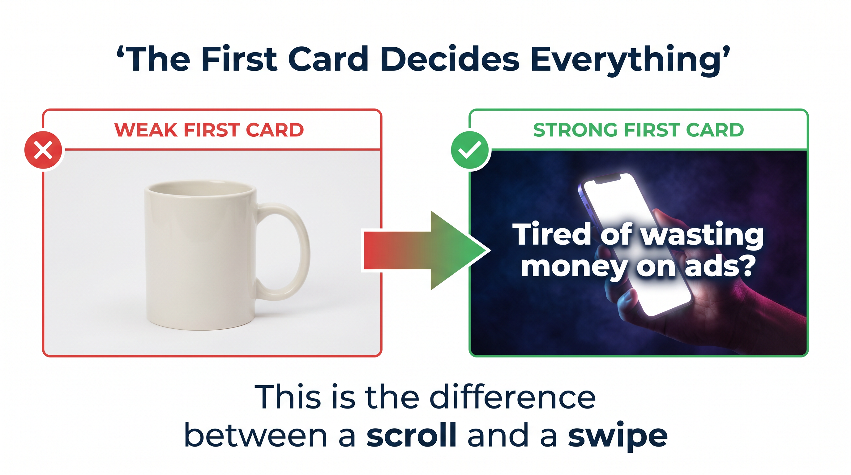
When a user sees a carousel ad in their feed, they do not see five images. They see one image. If that first image does not immediately arrest their attention, agitate a pain point, or spark intense curiosity, they will scroll past it in less than a second. They will never see card two. They will never see card three. The rest of your beautiful photoshoot is entirely wasted.
I see accounts burning thousands of dollars a day on carousels where the first card is just a generic picture of a shoe on a white background, or a corporate logo, or a bland lifestyle shot with no context. That is not an ad. That is wallpaper.
Your first card must do the heavy lifting. It needs to function as a standalone, scroll-stopping hook. It needs high contrast, a bold visual element, and ideally, text overlay that calls out the specific target audience or the core problem they are trying to solve.
Think of the first card as the headline of a sales letter. If the headline fails, the rest of the letter doesn’t matter. You have to earn the swipe. If you look at your Meta Ads Manager reporting and see a massive drop-off in impressions between card one and card two, you do not have a product problem. You have a first-card problem. Fix the hook, and the rest of the sequence will suddenly come to life.
You Are Building a Story, Not a Catalog
Once you have earned that initial swipe, what happens next?
If card two is just another random product shot, the user will immediately lose interest and bounce. The biggest mistake advertisers make is assuming the algorithm will figure out the order of the cards. (Pro tip: always uncheck the box that says “Automatically show the best performing cards first.” You want control over the narrative.)
A high-converting carousel ad tells a linear story. Each swipe should pull the user deeper into the narrative, building desire and handling objections along the way.
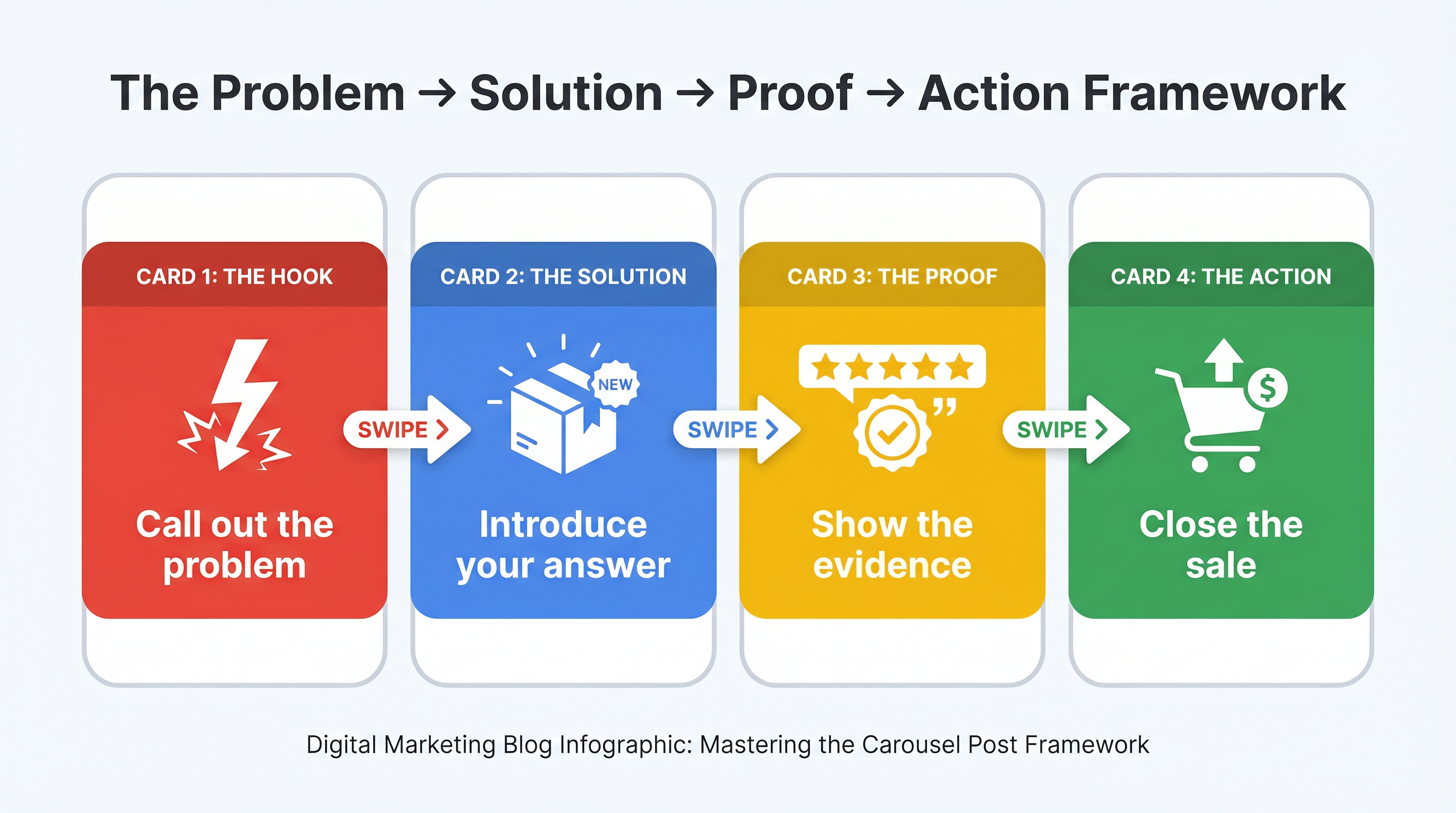
The most reliable framework I use for clients is the Problem → Solution → Proof → Action sequence.
Card 1 (The Hook & Problem): You call out the exact pain point the user is experiencing. “Tired of your coffee going cold in 20 minutes?”
Card 2 (The Solution): You introduce your product as the specific answer to that problem. “Meet the thermal mug that holds heat for 12 hours.”
Card 3 (The Proof): You provide evidence. This could be a screenshot of a 5-star customer review, a before-and-after comparison, or a diagram showing the technology inside the product.
Card 4 (The Action): You deliver a clear, unambiguous Call to Action (CTA). “Shop the Winter Sale now and get 20% off.”
When you structure a carousel this way, you are not just hoping someone likes a picture. You are actively guiding them through a psychological micro-funnel. By the time they reach the final card, they are primed, educated, and ready to buy.
The Per-Card Routing Strategy Nobody Uses
This final strategy is the most baffling omission I see in ad accounts, because it costs absolutely nothing to implement and can drastically improve your conversion rates overnight.
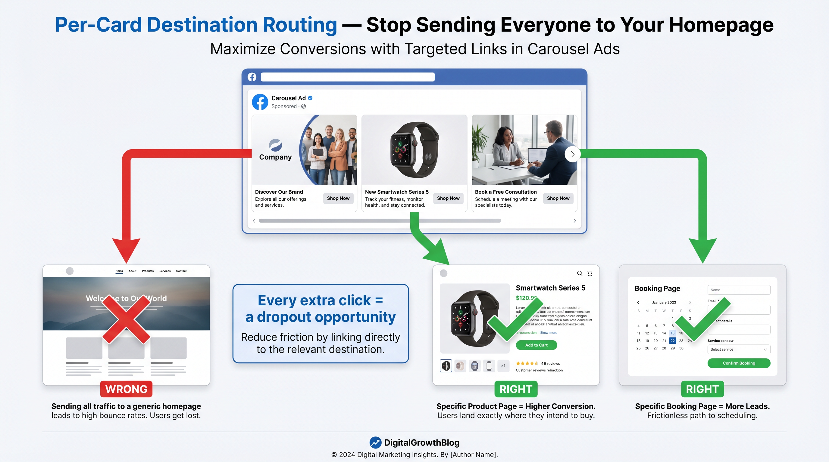
When you build a carousel ad, Facebook allows you to assign a unique destination URL to every single card. Yet, 90% of advertisers link every single card to their homepage.
Imagine walking into a massive department store because you saw an ad for a specific pair of running shoes in the window. But when you walk through the door, the greeter just gestures vaguely at the entire store and says, “Good luck finding them.” You would probably turn around and leave.
That is exactly what you are doing when you link a specific product card to a generic homepage. You are creating friction. Every extra click a user has to make to find what they just saw in the ad is an opportunity for them to abandon the session.
If Card 2 features your flagship software product, the link for Card 2 must go directly to the landing page for that specific software. If Card 3 features a customer testimonial about your consulting service, the link for Card 3 must go directly to your consulting booking page.
Message-to-page alignment is one of the strongest levers you have in paid media. The scent of the ad must perfectly match the scent of the landing page. When a user clicks a specific image, they expect to land on a page dedicated entirely to what was in that image. Deliver on that expectation, and your bounce rate will plummet.
Stop Guessing and Start Measuring
Before you launch another carousel ad, or before you give up on the format entirely, you need to look at the actual data.
Go into your Meta Ads Manager. Break down your carousel performance by card. Are people actually swiping, or are they dropping off immediately? Are certain cards getting all the clicks while others are ignored?
The data will tell you exactly what is broken. If the swipe rate is low, your first card is weak. If the swipe rate is high but the click-through rate is low, your narrative sequence is boring or confusing. If the click-through rate is high but the conversion rate is low, your per-card routing is probably dumping people onto a generic homepage.
Carousel ads are not a photo dump. They are a highly engineered sequence designed to capture attention, build desire, and eliminate friction. Treat them with the strategic respect they deserve, and they will become one of the most profitable assets in your advertising arsenal.
If your Facebook Ads are burning budget and you know your creative strategy is a mess, it’s time to bring in an expert. I audit, restructure, and manage paid advertising campaigns for businesses that are ready to scale efficiently.
👉 Work with Naz Diocampo on Upwork
The Anatomy of a High-Converting First Card
We established that the first card is the only card that matters. But what exactly makes a first card successful?
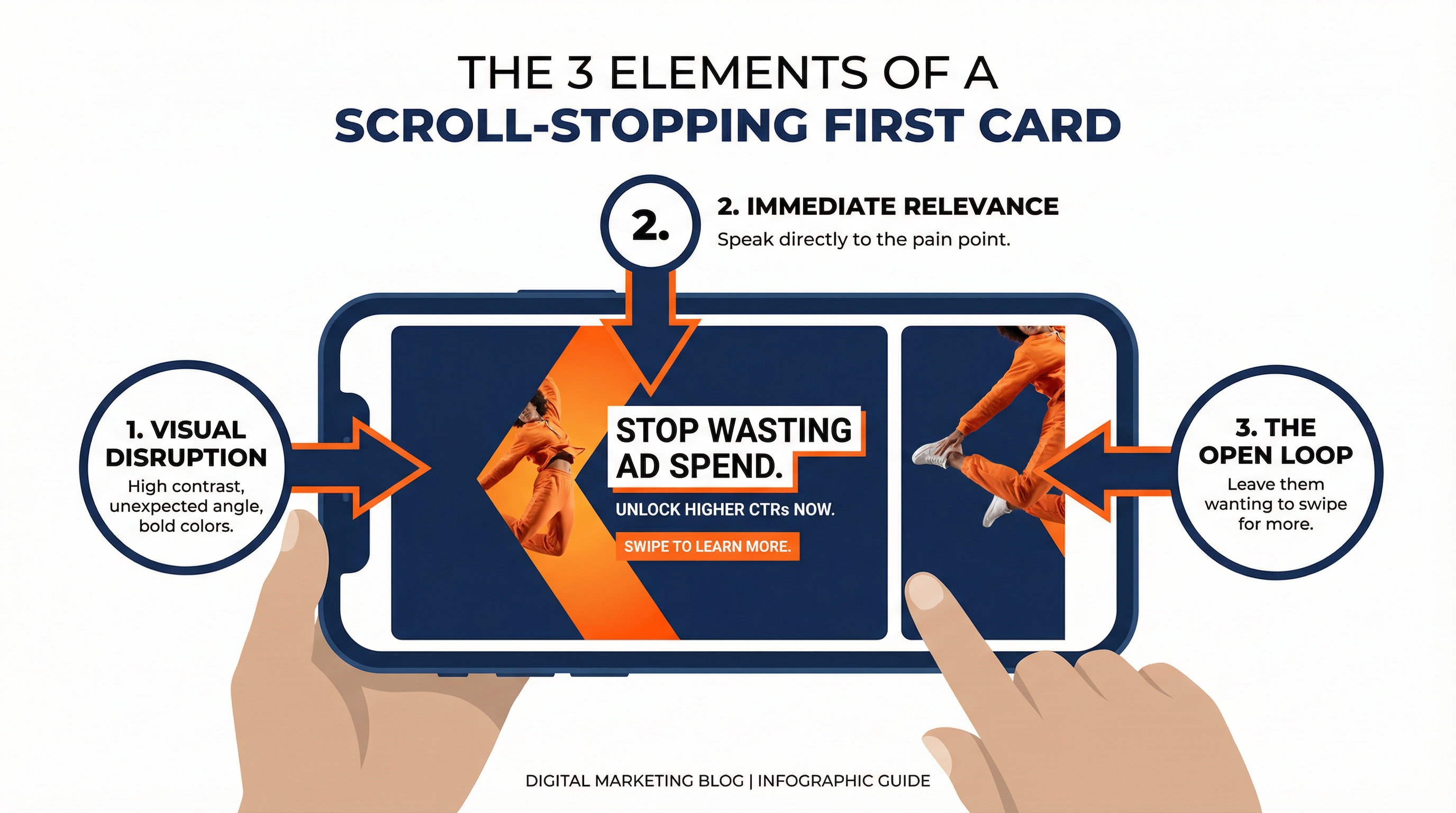
It comes down to three specific elements: visual disruption, immediate relevance, and an open loop.
1. Visual Disruption
When a user is scrolling through their feed, they are in a trance-like state. Your ad needs to snap them out of it. This is why a white-background product shot fails—it looks like a catalog, and nobody goes to Facebook or Instagram to read a catalog.
Instead, use high-contrast colors, bold typography, or an unexpected angle. If your brand colors are muted pastels, consider using a stark, dark background with bright, glowing text for your first card. The goal is to make the thumb stop.
2. Immediate Relevance
Once the thumb stops, the brain has about 0.5 seconds to decide if the content is relevant. This is where text overlays are crucial.
Do not rely on the primary text (the caption above the image) to do this job. Most users look at the image first, then the headline below the image, and only then do they read the primary text. Put your core value proposition directly on the image.
“Struggling to sleep?” “The last pair of work pants you will ever buy.” “How to scale your agency to $50k/mo.”
Speak directly to the person you want to reach. If the image is relevant to them, they will pause.
3. The Open Loop
This is the secret sauce of the carousel format. An open loop is a psychological trigger that creates curiosity. It presents a piece of information but leaves it incomplete, forcing the user to take action (in this case, swiping) to get the rest of the story.
You can create an open loop visually by having an image that spans across two cards. The user only sees half of the image on the first card, and they instinctively want to swipe to see the rest.
You can also create an open loop with copy. “The 3 reasons your diet is failing (Swipe to see #1)…” or “Before you buy another CRM, check this…”
If your first card is visually disruptive, immediately relevant, and creates an open loop, your swipe-through rate will skyrocket.
Common Carousel Mistakes That Kill ROI
Even if you nail the first card, the narrative sequence, and the per-card routing, there are a few subtle mistakes that can still sabotage your campaign.
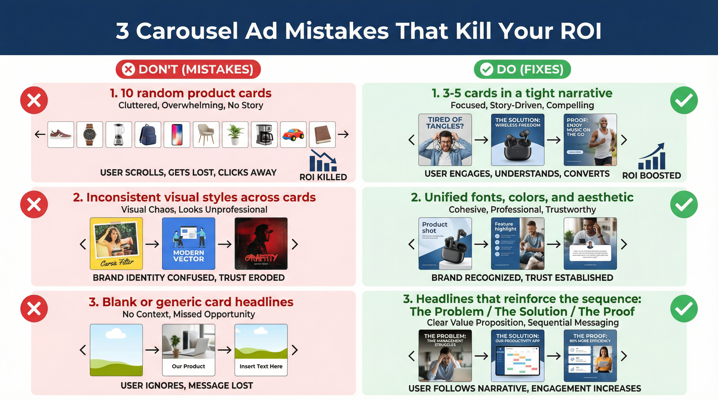
Mistake 1: Too Many Cards
Facebook allows you to use up to 10 cards in a carousel ad. That does not mean you should use all 10.
In my experience, the sweet spot is 3 to 5 cards. If you use 10 cards, the narrative becomes exhausted. The user gets bored and abandons the sequence before reaching the final call to action. Keep it tight, punchy, and focused.
Mistake 2: Inconsistent Formatting
A carousel ad should feel like a cohesive, unified experience. If Card 1 is a professional studio shot, Card 2 is a grainy iPhone photo, and Card 3 is a text-heavy graphic, the ad feels disjointed and amateurish.
Maintain a consistent visual style across all cards. Use the same fonts, the same color palette, and the same general aesthetic. This builds trust and makes the brand feel premium.
Mistake 3: Weak Headlines
Beneath each carousel card is a short headline. Many advertisers leave this blank or use it to repeat the product name.
This is prime real estate. Use the headline to reinforce the narrative sequence.
Card 1 Headline: “The Problem.”
Card 2 Headline: “The Solution.”
Card 3 Headline: “See the Proof.”
Card 4 Headline: “Shop the Sale.”
Treat every single element of the ad—the image, the text overlay, the primary text, the headline, and the destination URL—as a critical piece of the conversion puzzle.
The Final Verdict on Facebook Carousel Ads
Facebook Carousel Ads are not a dumping ground for your extra product photos. They are a sophisticated, multi-step psychological framework designed to move a user from apathy to action.
If you are currently running carousel ads and seeing poor results, do not blame the format. Blame the execution.
Audit your current campaigns. Look at the drop-off rate after the first card. Check your destination URLs. Evaluate the narrative flow.
Implement the strategies outlined in this guide—the scroll-stopping first card, the Problem-Solution-Proof sequence, the per-card destination routing, and the avoidance of common formatting mistakes—and you will transform your carousel ads from a budget-draining liability into a highly profitable asset.
2 Comments
I enjoyed this article. Carousel ads work much better when each card has a purpose and helps move the story forward. Too many advertisers just upload random images without thinking about flow or conversion intent.
Thank you for your comment. I completely agree. Carousel ads perform better when they are structured with intention, not just filled with extra images. Each card should contribute to the message and guide the user toward action. Glad you found it valuable.